
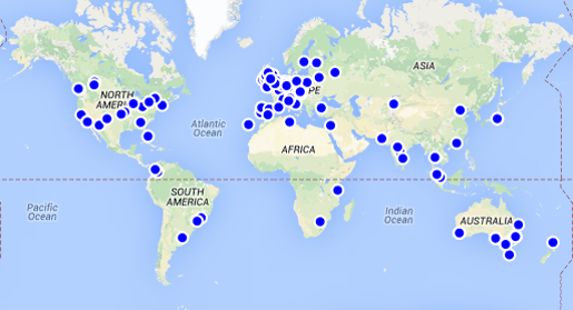
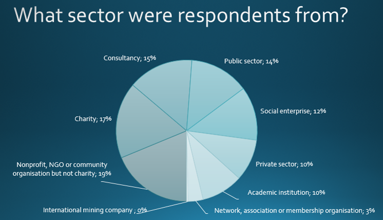
In September 2014, people involved with social impact analysis were sent a survey through the Social Impact Analysts Association and their country impact groups. A map of where the respondents were from is above, and a pie chart of which sector they worked in is below.
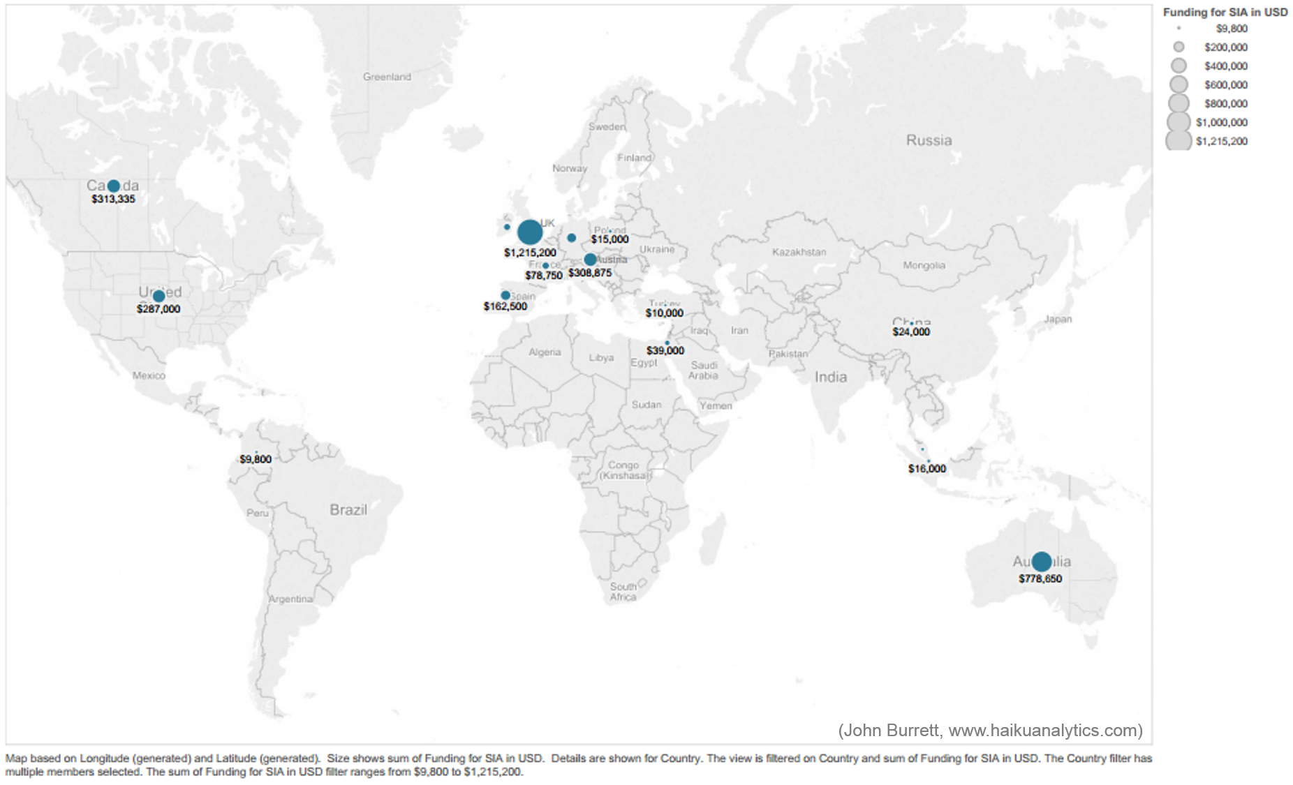
John Burrett, master of presenting data, has published a beautiful analysis of the data using tableau public, a sample of which is this map below:
Sum of the amounts reported by organisations in that country, for their latest social impact analysis (US dollars).
Click here to perform your own analysis of the data on Socrata’s open data platform.
The best set to analyse is the one called SIAA International Survey 2014 – it’s a cleaned subset of the raw data. On the top right hand corner of your screen you’ll see a button that says ‘export’, which will give you options for a spreadsheet. Making a pivot table of the dataset is the easiest way to begin looking at it. The data is licensed under Creative Commons 3.0 Attribution so please feel free to reuse and publish. We’d love to see what you publish, so post a link at the bottom of this page to your work.
Original questions
You may want to use the original survey questions and responses to understand what questions were asked:
SIAA International Survey 2014
Results of individual questions
Or use the report of selected responses to individual questions – this is probably the best overview of the responses.
Please send us your analysis. We’d love to share it.
Questions for analysis
Please use the comment box below to add your questions for analysis. So far people are curious about:
- experience and expertise as related to sector
- what frameworks/tools/approaches dominate in different countries
- whether there is a higher use of control groups than expected, or whether this might indicate some methodological misunderstanding (or a problem with the question).
